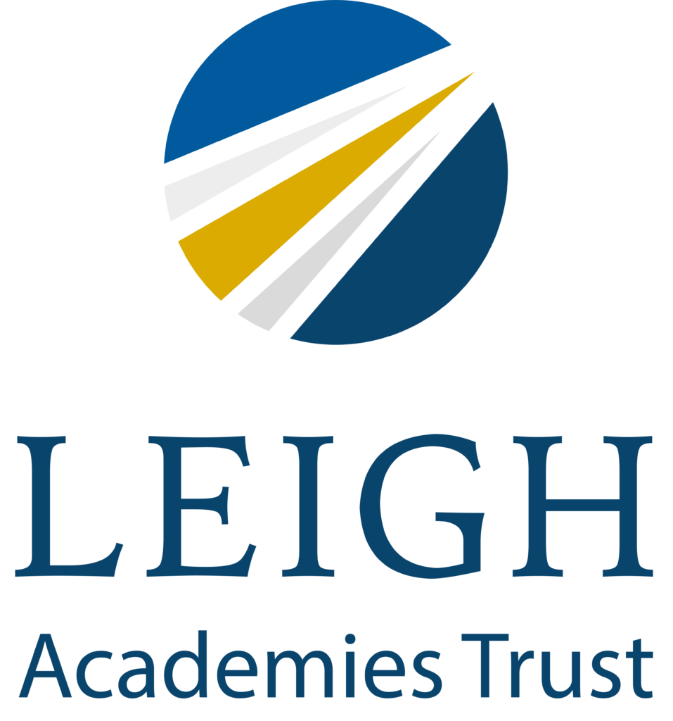
Today at Leigh Academies Trust (LAT), we’re proudly announcing our new logo. Launching this September, after fourteen years of transforming the lives and communities we serve, we sought something that would hold true to our roots whilst embracing everything which has made us who we are today. We thought it might be nice to explain what our new logo means to us.
Starting with the overall shape, we opted to go with a circular logo to represent the global curriculum which is delivered at all of our academies: the International Baccalaureate. We also feel that a circular shape denotes unity; elements of our new logo pull together to create something that is greater than the sum of its parts, which is how we view LAT and the academies within it. An added benefit – and happy coincidence – is that this same circular shape lends itself to being utilised across online platforms and is in keeping with the trends in the social and digital world. The round shape of our logo is complemented by the curve of the ‘G’ that sits alongside it in our name, ‘Leigh’. The capitalisation used here is a key feature that we chose to retain from our original logo.
The white space within our new round icon forms four lines that are inspired by the Queen Elizabeth II Bridge (otherwise known as the Dartford Crossing) which formed the focus of our original logo, and acts as a reminder of where we began. This adaptation of the bridge, which previously formed the entirety of our brand’s identity, is no longer so significant; we have grown beyond our origins, yet still retain the essence of who we are in our mission to shape the lives of those we serve.
The lines within the logo create the impression of a pathway, pointing in an upward and forward direction. This aspect of the logo takes inspiration from a shooting star, emphasising the message that we strive to reach and achieve our goals, fitting perfectly with our values of ‘boundless ambition’, to ‘keep getting better’ through continuous improvement and innovation. This pathway is intended to convey the journey that is taken by both students and staff during their time with us; whether it be personal, professional or educational, we encourage everyone to aspire to achieve all that they can throughout their journey with LAT.
When it came to selecting the colours for our logo, it was only natural that we would incorporate the original ‘LAT blue’, but we decided to give it a bit of a refresh this time around. The bold yellow gold at the core of our icon was inspired by LAT’s Vision 2025; our commitment to making the world a better place. We can proudly say that we have already achieved most of the objectives we had set for ourselves within this Vision, and are now in the process of setting ourselves new goals for Vision 2030, which we hope to share with you later in the year.
At the same time as launching our new logo, we are changing the Trust’s mission statement to reflect our growing ambitions and deep commitment to an IB education. From September our mission statement will be the same as the International Baccalaureate Organisation:
Education for a better world


